DERMTHEORY
The Brand
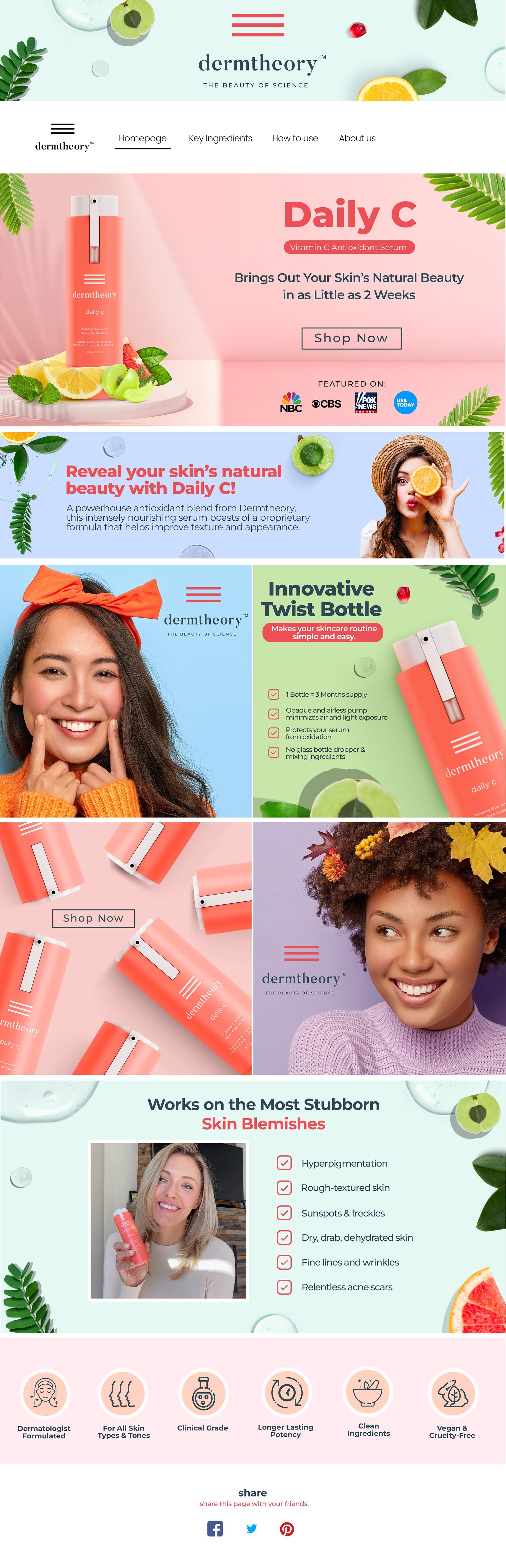
Dermtheory is skincare for young adults who think effective skin science doesn't have to feel clinical. The formulas do the serious work, so the brand just needed a personality bold enough to match.
The Scope
The Brief
Dermtheory wanted a brand that felt fun and a little quirky, without ever hiding what the products actually do. The goal was to stand out in a sea of look alike skincare competitors, stay visually striking on the page, and feel genuinely relatable to a young adult audience hunting for something different.
The Process
Bright colors & bold type
Leaned into a high contrast palette and confident, oversized type to give Dermtheory an instantly playful feel that pops in a crowded category.
One consistent brand system
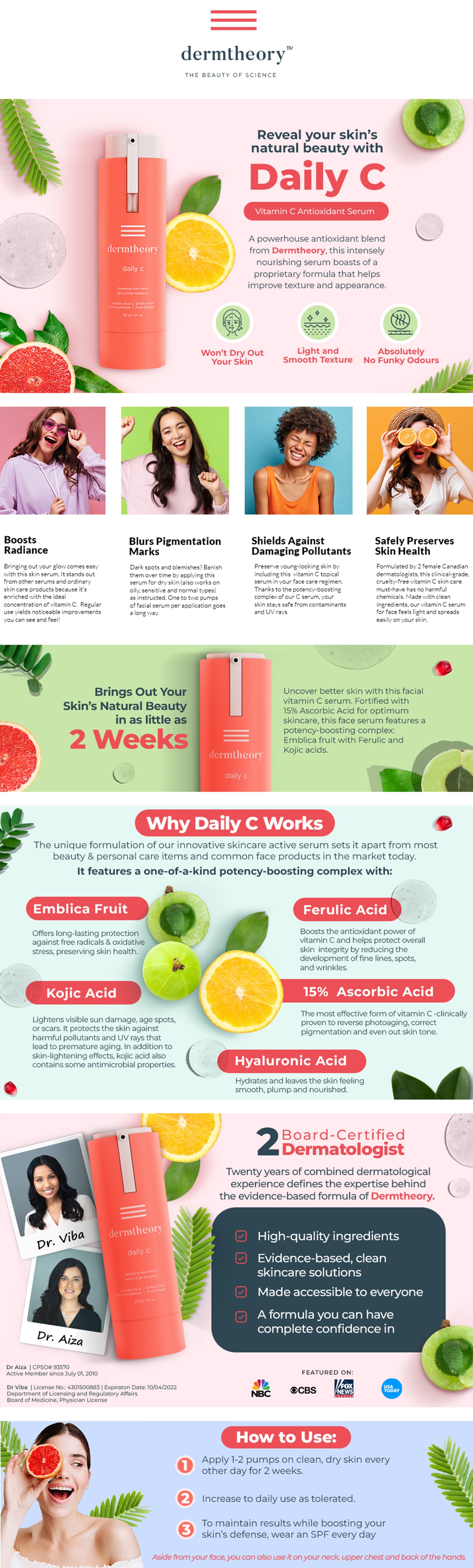
Built a single visual system across the listing, A+ Content and Storefront so every touchpoint feels like the same brand. That repetition is what makes it stick, and memorable.
Unexpected visuals
Added surprising, delightful moments that catch the scroller off guard, the kind of detail that earns a second look and keeps people coming back.
Features that still sell
Kept the science front and center: every fun visual still ladders back to a real product benefit, so shoppers are entertained and convinced to buy.
A+ Content
Store Front